Investors understand time is money. Effectively developed dashboards keep you on track.
Top characteristics of Dashboards
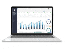
No one wants to spend hours crunching numbers from multiple spreadsheets to uncover the essential decision-making data. That’s why an intuitive dashboard makes sense. Dashboards display the essential real estate portfolio data in an easily digestible visual form to impart a sense of a portfolio’s performance. As the STRATAFOLIO team knows from experience, designing a functional, user-friendly dashboard truly is a work of art, and not all investment dashboards are created equal.
Make sure yours delivers the right data at a glance so an effective data dashboard should:
1. Dashboards Align With Goals
Most investors have goals and objectives for their money. If not, start by clearly defining the investment’s purpose. Each investor designs goals differently: by portfolio, venture, property, or combination. In Top 5 Best Practices for Creating Effective Dashboards, the first tip hits on choosing the right metrics. What will key performance indicators (KPIs) will demonstrate? Good KPIs will show you the progress, or lack thereof, towards capital goals, so once you know the relevant KPIs that match the investment goals, customize the dashboard to align. For example, if the goal is to increase the portfolio’s net operating income (NOI), the relevant NOI metrics are displayed upon login. Likely, an investor would want to see overall NOI, cash flow, a breakdown of cash flow, and/or operating expenses versus income by assets.
2. Use the Right Visuals
Investment goals drive the data visualization used in the dashboard. Is the overarching portfolio trying to improve quarter-over-quarter returns? Then the visual should compare numbers, such as with a bar chart. Perhaps the goal is to diversify the portfolio. A composition graphic like a pie chart would better reflect the capital distribution. You shouldn’t need to dig into the displayed chart to comprehend the data. A blog by Microsoft Power BI provides more tips to avoid visualization mistakes with “good” and “not-so-good” examples.
3. Place numbers into context
Data does not exist in isolation. Investors need to see the relationships between key data sets to understand the bigger picture. How do the current numbers fit into overall trends? How do they compare to last quarter or last year? Well-designed dashboards group-related data sets so users can understand influences quickly. For instance, decreasing tenant revenue could decrease distributions and NOI.
4. Keep data current
An effective dashboard provides data that will help users modify their performance according to real-time market changes. Displaying out-of-date data does a disservice to its users. Note that if the investment goals change, naturally the primary measurements change. Of course, the dashboard must reflect the new objectives. For example, if the goal changes to reducing tenant turnover as a method of increasing annual cash flow, the initial metrics need to match that goal.
It’s important to ensure your data is protected. Read more about the importance of data protection in our blog.
5. Tell a story
Looking backward is common practice with data dashboards. Because understanding what has happened is important. However, the best dashboards connect the past, present, and future. Numbers educate investment decision-making. When logging in for a quick update, investors need to see the whole picture of where they have been and where the portfolio might be heading. Consequently, this allows investors to change course. Future projections might indicate it’s worth holding onto a property longer than planned. Or, equally important, that now is the time to dispose of an asset. Of course, making crucial decisions based on a single screen is unwise. All dashboards should have the option to drill down further into the numbers, but without cluttering the initial desktop.
6. Logical layout
Real estate investors are busy people managing more than their investments. Most importantly, dashboards save time with crunching numbers and evaluating data. Sequencing matters. First of all, layout data dashboards to find the most important data within five seconds. Generally, this means the most significant data is right on top, trends, and comparisons to tend to be in the middle, and our deeper numbers will be towards the bottom. Learn more about data arrangement from Common Pitfalls in Dashboard Design.
Finally, well-organized dashboards help investors save time and better understand portfolio performance by analyzing big data and condensing it into an easy-to-read format. While it’s tempting to throw every possible metric onto the screen, it’s better to keep the initial dashboard simple. Drill down deeper into data as needed. Most of all, a strategically designed dashboard provides confidence that you are making the right decision for your real estate portfolio.